
National University of Singapore
See the Possibility
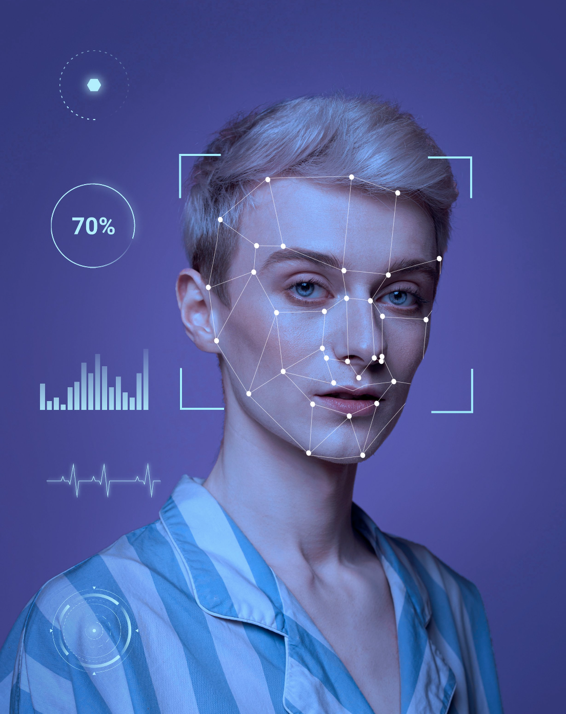
ROLE: UI/UX DESIGNER • UX RESEARCHER
NUS Giving, the philanthropic arm of the National University of Singapore, aims to transform lives and empower societal change through education and research. Despite its impactful mission, the platform faced a critical challenge: a cumbersome user experience and a lack of transparent impact communication led to low donation rates.

Research Statement & Goals
To address the challenges faced by NUS Giving, we conducted comprehensive UX research. Our objective was to understand the barriers potential donors encountered, their motivations for donating, and how to foster a greater sense of trust and engagement through the platform.
Our data identified four key donor personas, each with unique motivations and concerns regarding donations.
Our UX research methodology encompassed stakeholder interviews, user surveys, and usability testing. This multi-faceted approach allowed us to gather rich, insightful data on the user experience and expectations of the donation platform.
-

Corporate Leaders
-

Faculty Staff
-

Current Students
-

Alumni
Findings & Insights
-
There was a strong desire among donors to understand exactly how their contributions would be used and the direct impact of their donations.
-
Users found the platform difficult to navigate, often struggling to find information on how to donate or the outcomes of their contributions.
-
Potential donors expressed that a more engaging narrative and visual representation of the donation impact would significantly increase their trust and likelihood to donate.
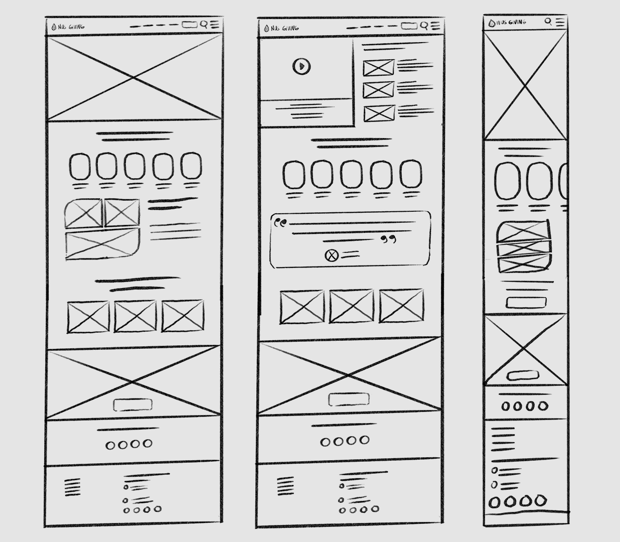
Setting up the action
Leveraging research findings and aligning with our business objectives, I iterated on the concept through hand sketching, refining our approach. This led to a streamlined information architecture emphasizing content discovery and simplified navigation.
Ideas to action
The ideation phase involved extensive brainstorming with the product team, leading to the creation of wireframes and prototypes for testing. This collaborative effort culminated in the creation of an enhanced design system.
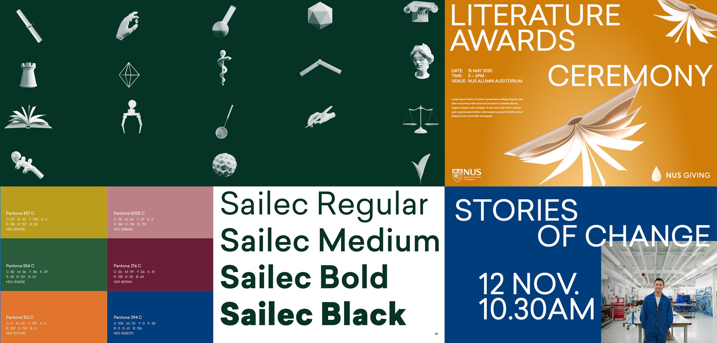
This redesign emphasized simplifying the donation process and effectively communicating the impact of contributions through key pages:
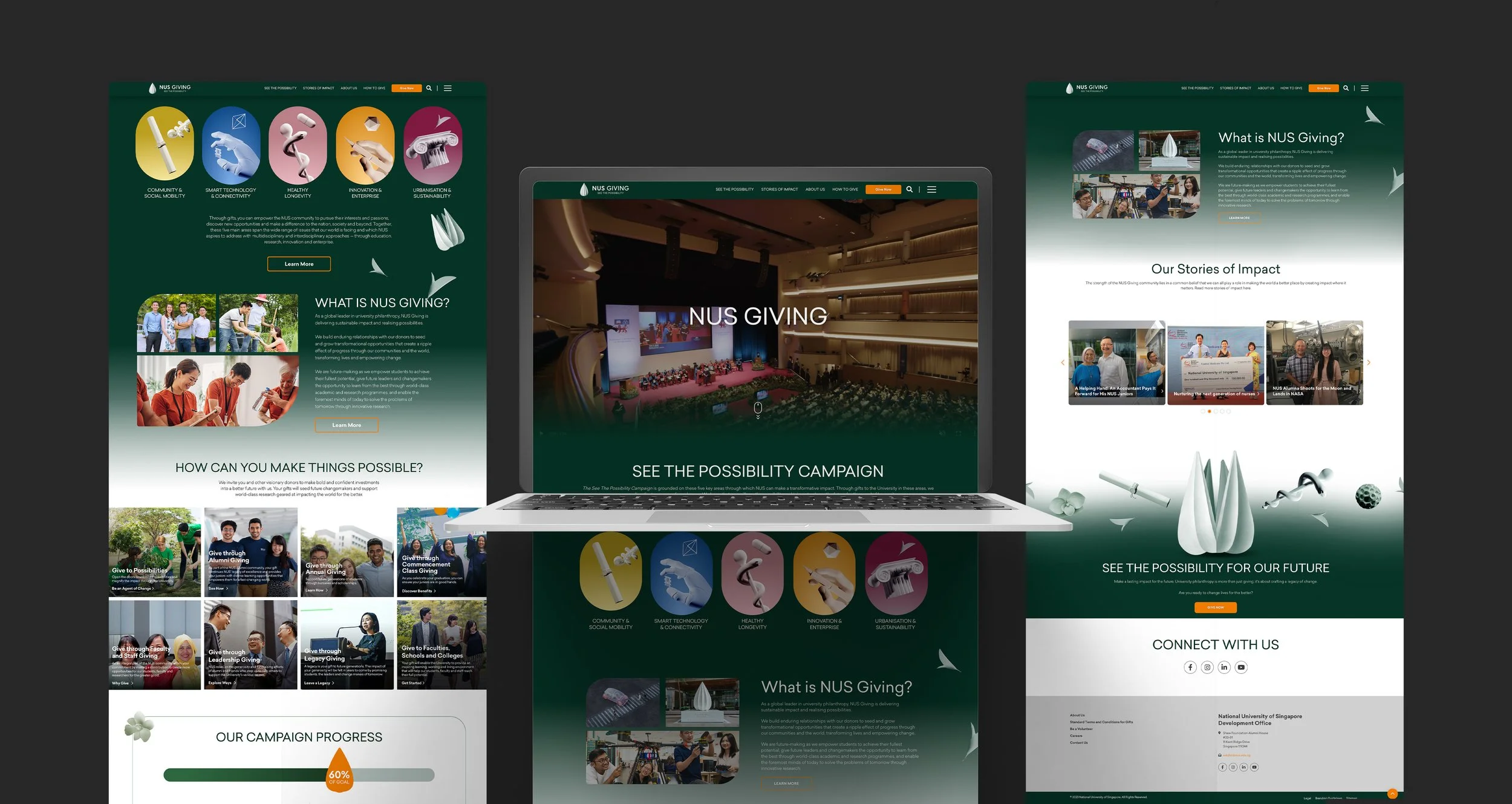
Home page
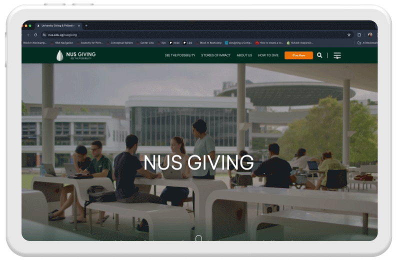
The gateway to the NUS Giving experience, the homepage received a significant overhaul to engage visitors immediately. With a clear and inviting presentation of the "See the Possibility" theme, the homepage sets the tone for the entire user journey.
-
Upon entering the site, users are greeted with a simplified navigation structure that makes it easy to understand the types of giving, causes to support, and upcoming events.
-
At the end of every page, a CTA banner is strategically placed to provide a clear, direct call to action along with a prominent button to donate.
-
Visitors can donate depending on the cause they support, such as community, sustainability, health, and innovation.
-
The platform automatically adjusts to fit different screen sizes, ensuring that all elements are appropriately scaled and easy to interact with, regardless of the device being used.


Ways of Giving
Prominent Link in Main Navigation: Users can clearly choose different ways to give, causes to support, and access news and events showcasing the use of their donations.

How to Give
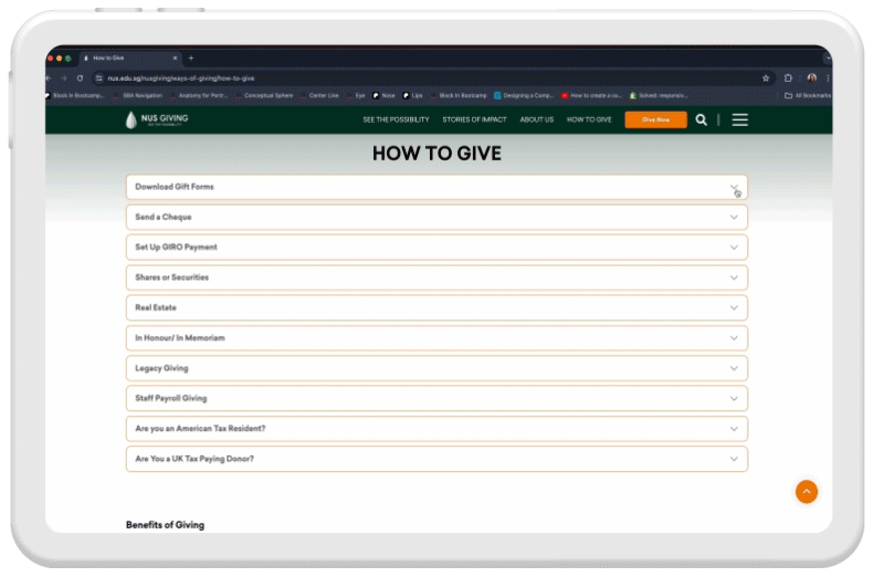
Offers different ways to give through various payment methods, designed in an accordion format for clean and easy access. This page also provides information on the benefits of giving, such as tax benefits, naming opportunities, and recognition.
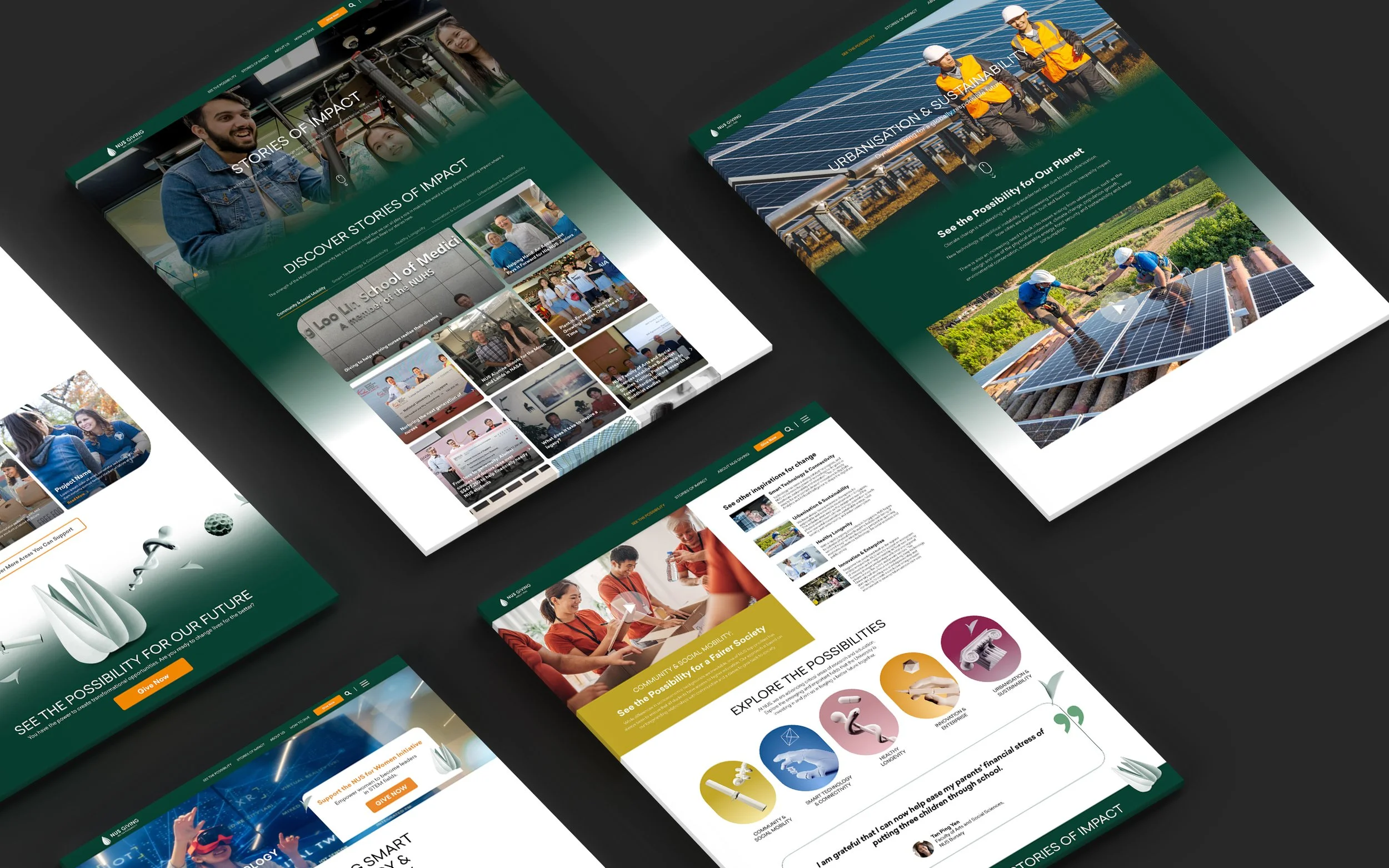
Stories of Impact
Highlights the tangible outcomes of donations with compelling stories, building trust and deepening connections between donors and beneficiaries.
-
Organizing stories by category to enhance discoverability.
-
Using videos to tell the stories in a more engaging way.
-
Providing visibility to donors by showcasing real-life impact stories.
Next steps and recommendations
Following the research, we recommended ongoing user feedback sessions, A/B testing of new features, and continuous monitoring of platform analytics to refine and adapt the user experience further.
RELATED PROJECTS
-
![]()
Mirar
-
![]()
vive live