
Serenity in Every Stitch
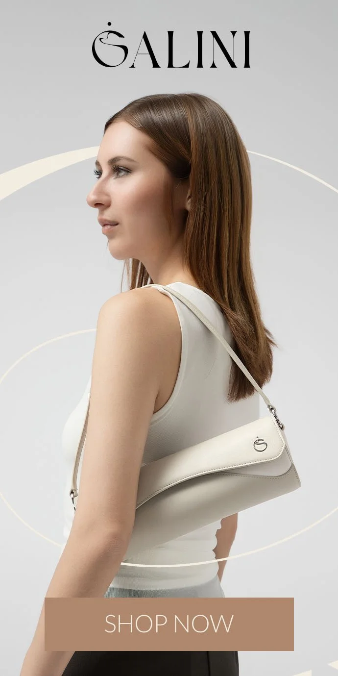
GALINI
ROLE: ART DIRECTOR • DESIGNER • CONTENT WRITER
A team of Hong Kong fashion designers approached me to build the brand identity for their new label, GALINI. In an already crowded bag market, their mission stood out: create high-quality, enduring, and sustainable pieces inspired by nature and the Greek idea of calmness that the name “Galini” represents.
Crafting the identity
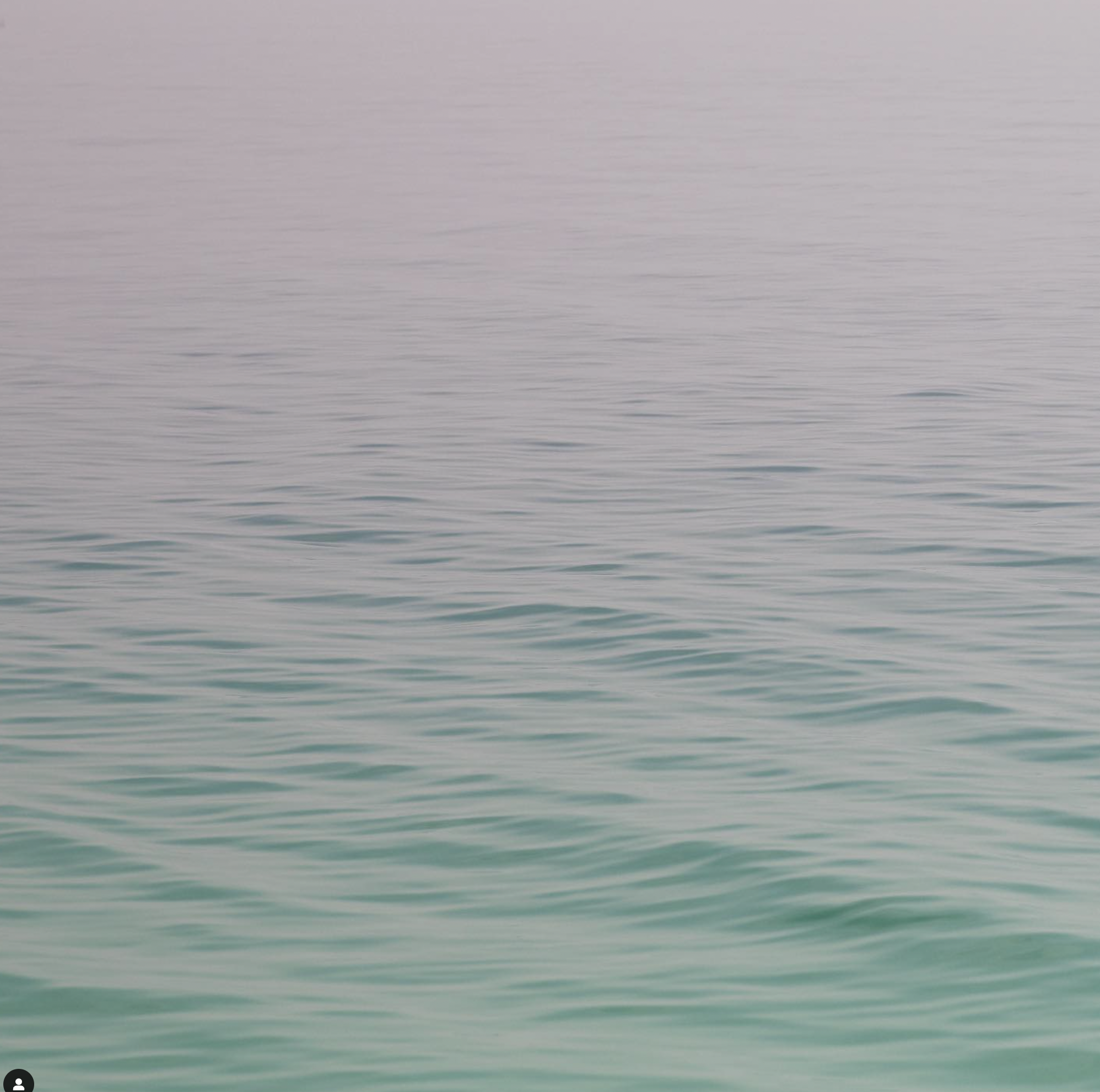
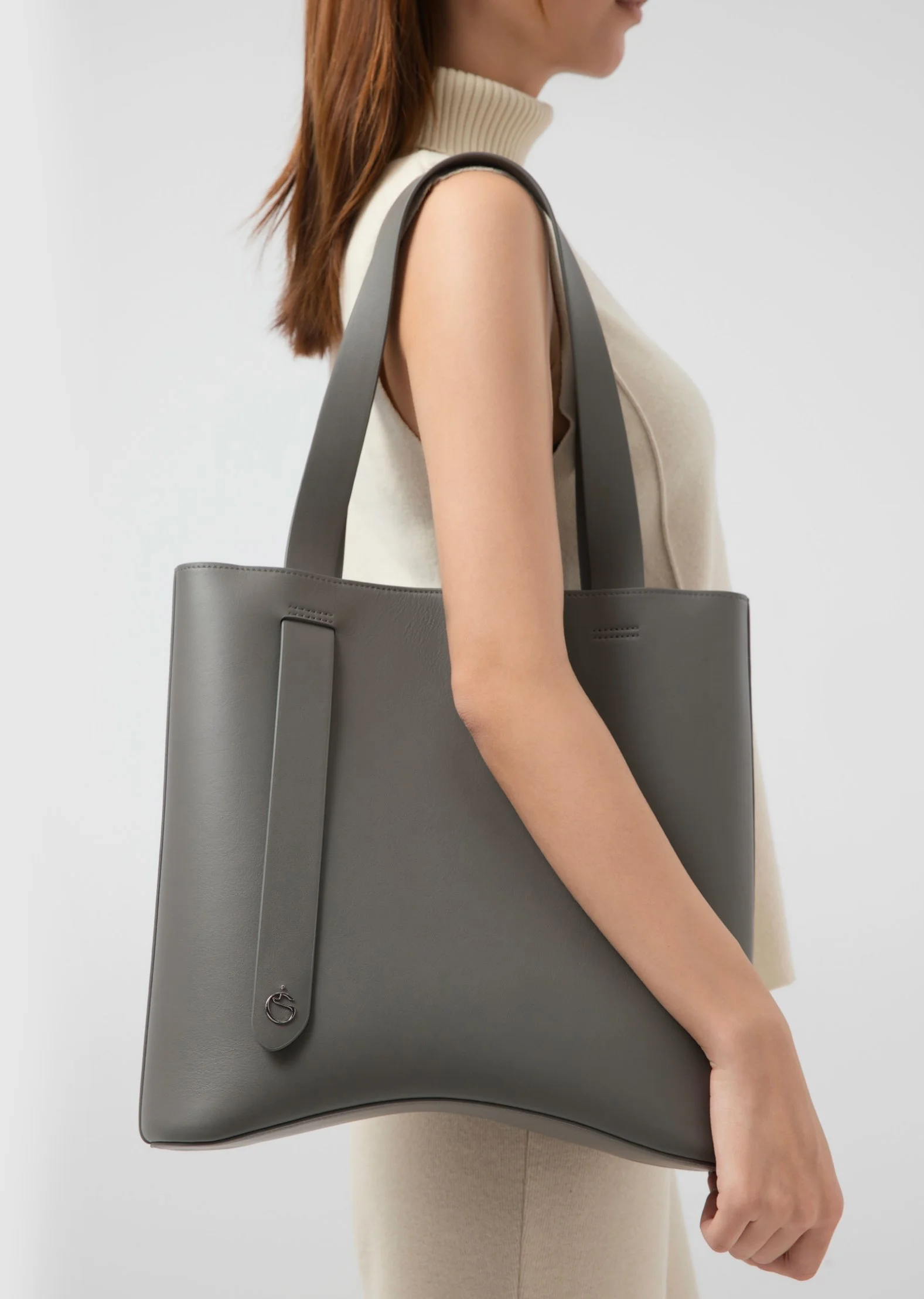
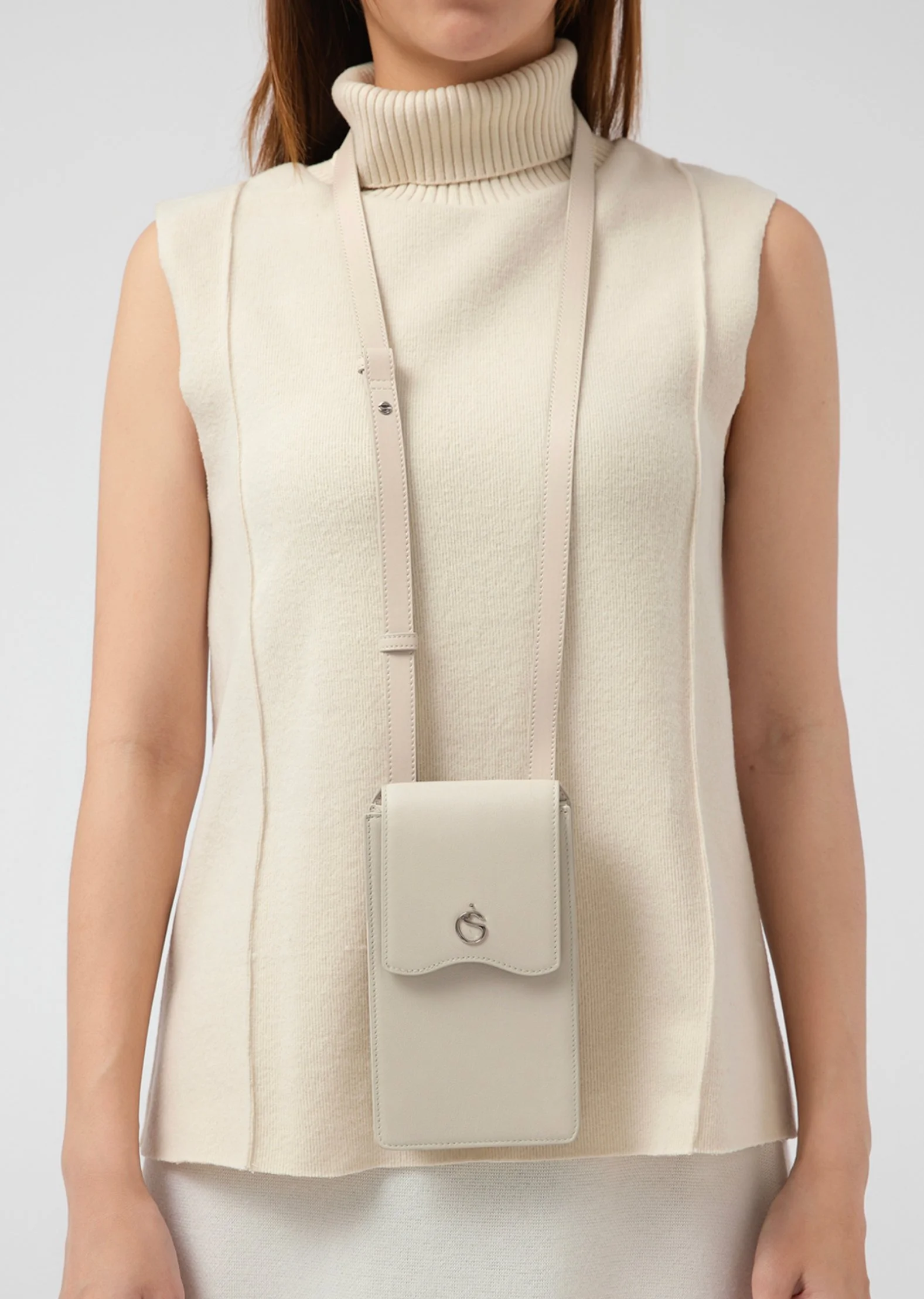
Over coffee, Galini’s product designer shared sketches inspired by the ocean’s rhythm and feminine grace. She imagined each bag as a calm, distinctive piece for women who appreciate subtle beauty.
A Symbol of Serenity
Galini’s G features a gentle S-curve that symbolizes calm and balance in the middle of urban life. The wordmark pairs this curve with sharp, modern letterforms that give the brand a sleek, contemporary feel. Together, they express Galini’s focus on quality and quiet confidence.
-
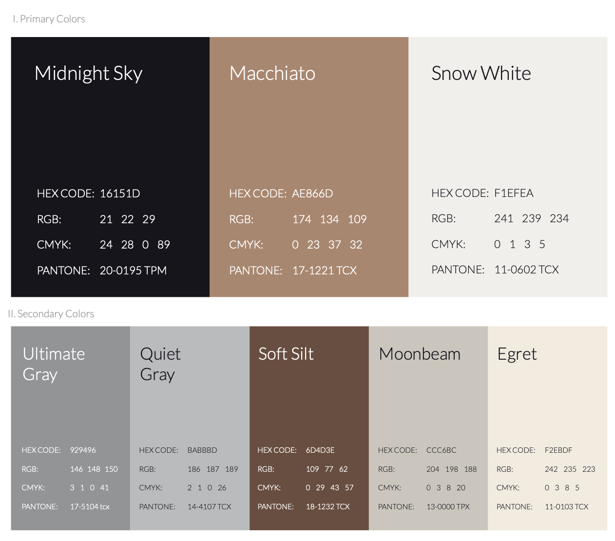
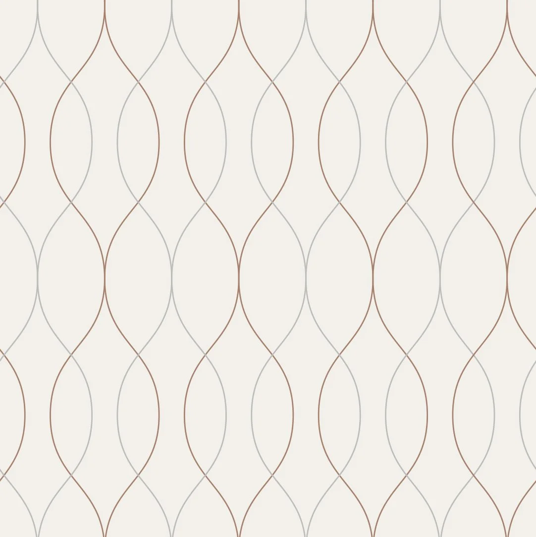
Color Palette
The colour palette draws inspiration from the earth’s natural hues. These colours evoke feelings of groundedness, authenticity, and tranquility.
-

Iconography
The minimalist yet expressive iconography carries the logo's curvilinear motifs, ensuring the brand's message of peace and elegance is felt in every visual touchpoint.

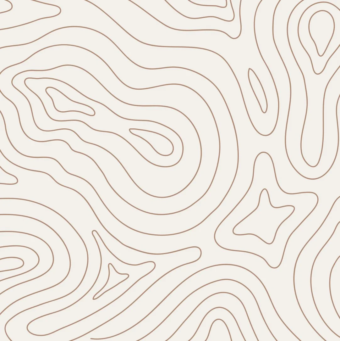
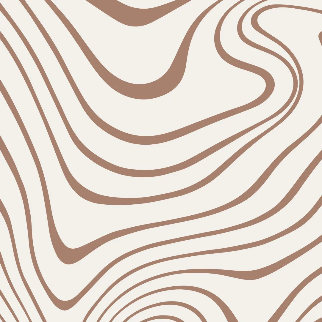
Using the logo’s curves, I developed wave and circular forms that function as light patterns and accents. They add flow without overpowering the identity.


Bringing it all together
The logo was meticulously crafted to stand out on the actual product or printed materials. Its simplicity and iconic nature were designed to make a statement.

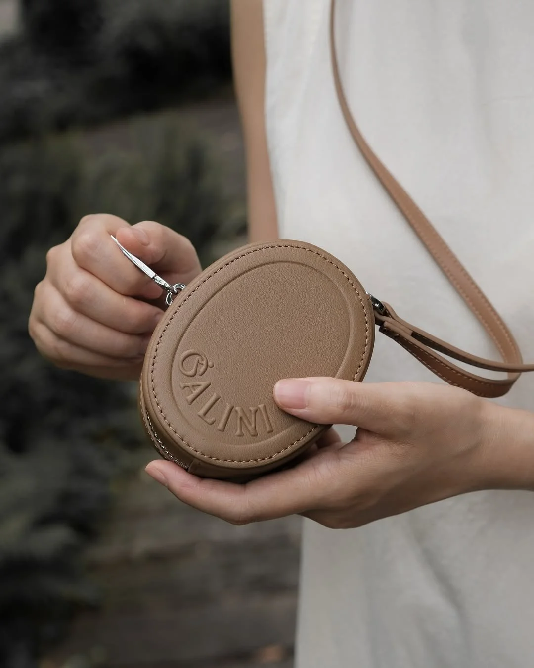

The fluid graphics appeared sparingly in digital materials, each placement chosen to enhance the design and maintain a serene, cohesive presence.


RELATED PROJECTS
-
![]()
Transformasians
-
![]()
NUS Medicine
-
![]()
Wok Way