
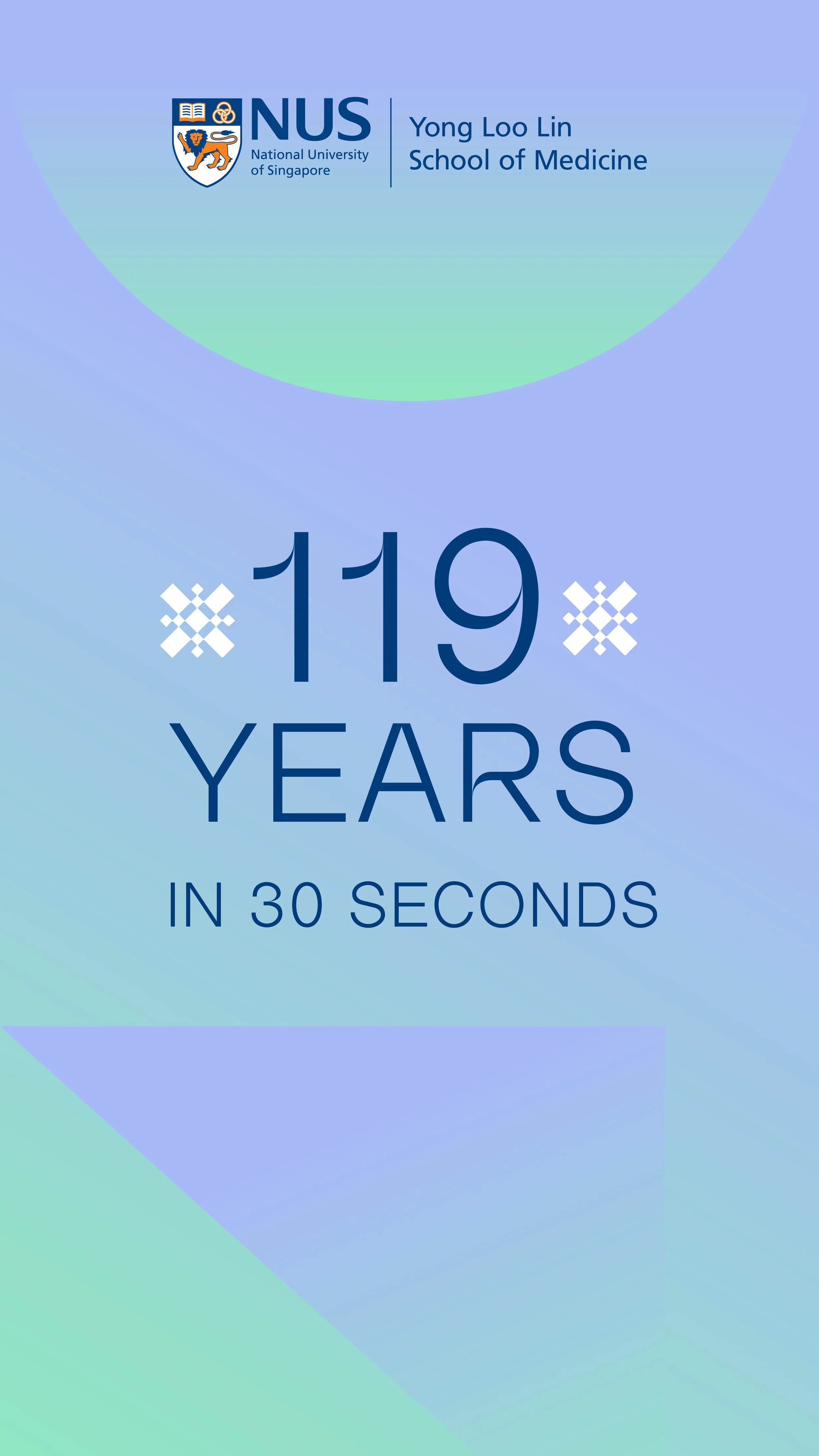
Celebrating Infinite Possibilities
NUS MEDICINE
ROLE: ART DIRECTOR • DESIGNER
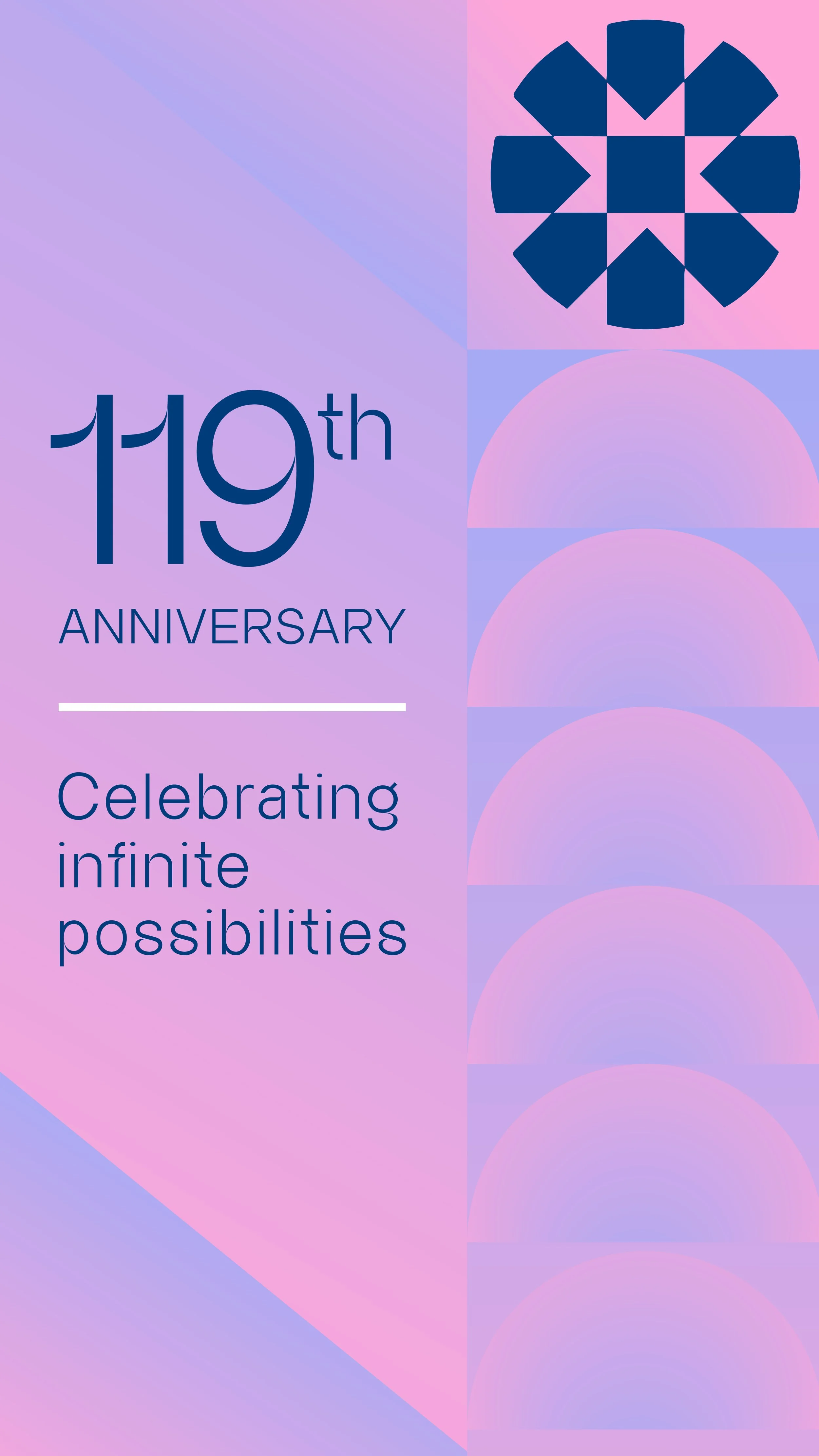
As NUS Medicine marks its 119th anniversary, the occasion calls for a brand identity that not only highlights its storied achievements but also illuminates the path ahead in the medical field. Steering away from traditional corporate hues, the focus shifts to employing a vibrant, refreshing gradient palette that reflects the innovative spirit of NUS Medicine.
Crafting the identity
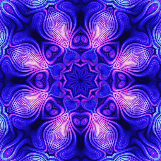
Drawing inspiration from the mesmerizing, ever-changing patterns of a kaleidoscope, this theme captures the dynamic and expansive nature of NUS Medicine's legacy. Spanning 119 years, its journey is one of continual learning, discovery, and compassion, each element contributing to a future where the possibilities for medical advancement are boundless.

A Symbol of Infinite Discovery
The logo, shaped like a kaleidoscope, reflects the endless possibilities that arise from 119 years of medical innovation and education at NUS Medicine. It captures the essence of transformation and continuous discovery in the field of medicine.
Vibrant Spectrum of Progress
The gradient comes from the brand’s secondary colors. We applied it in kaleidoscope-like patterns to reflect a colorful world of possibilities within medical science.


Elegantly Forward-Thinking
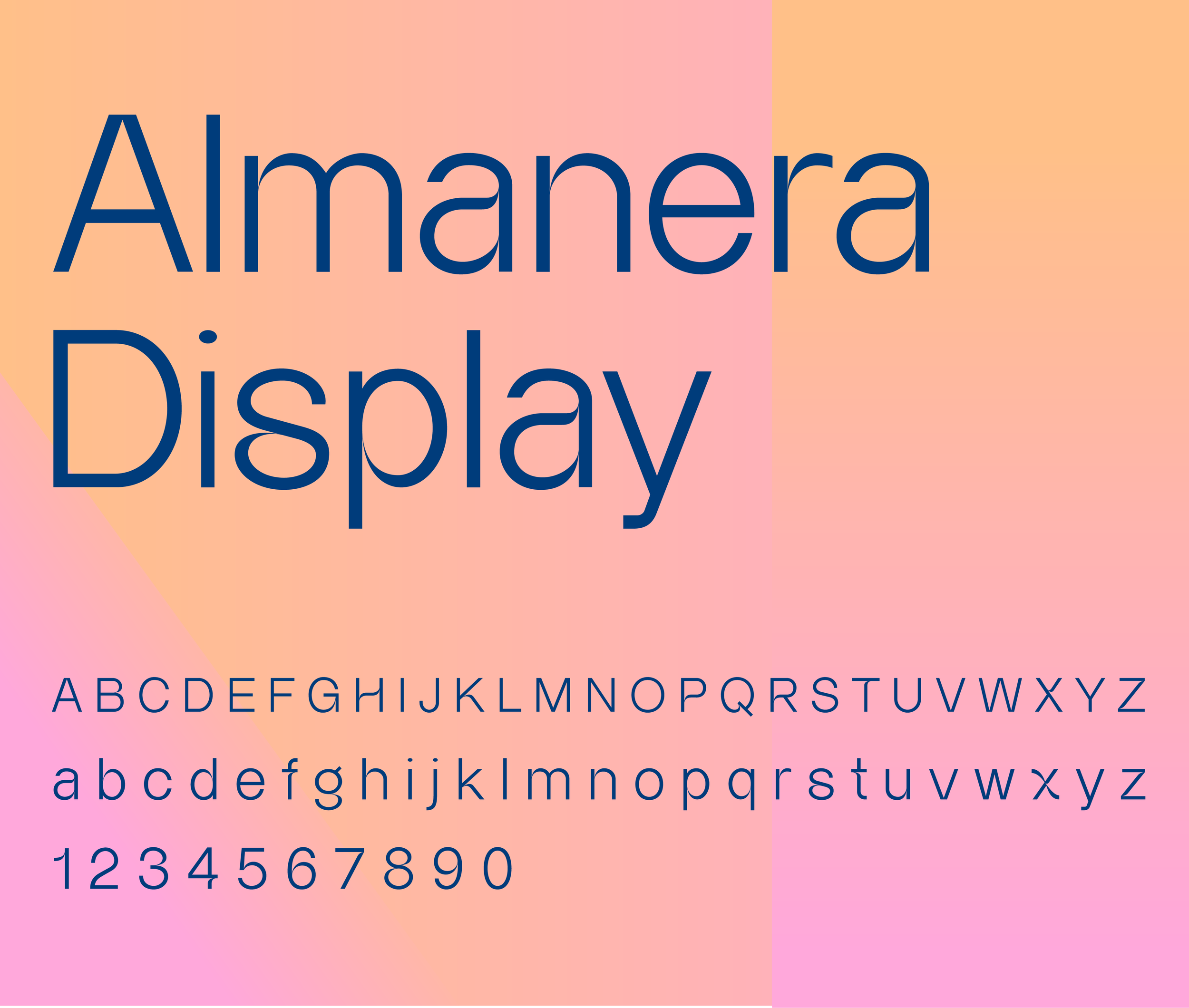
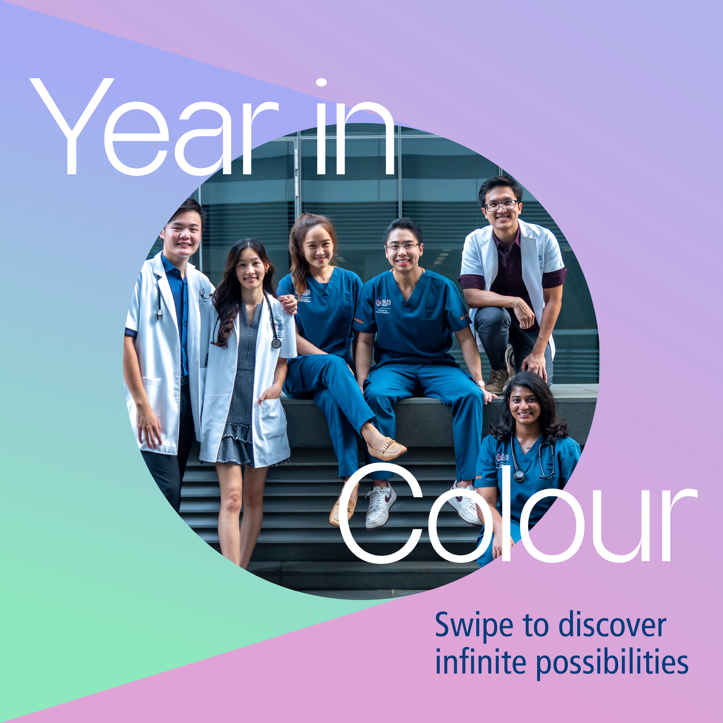
The typeface is modern and forward-looking while still maintaining a professional, academic feel.
The iconography features shapes inspired by a kaleidoscope, used as light accents that add depth and reflect the complexity of medical science.
Bringing it all together
The final design integrates kaleidoscope patterns as backgrounds with the distinctive shapes used as accents. This creates a refreshing set of graphics that not only capture attention but also convey the rich tapestry of NUS Medicine’s contributions and aspirations.


RELATED PROJECTS
-
![]()
Wok Way
-
![]()
Transformasians
-
![]()
Galini