
happiness in a bowl
wok way
ROLE: ART DIRECTOR • DESIGNER • CONTENT WRITER
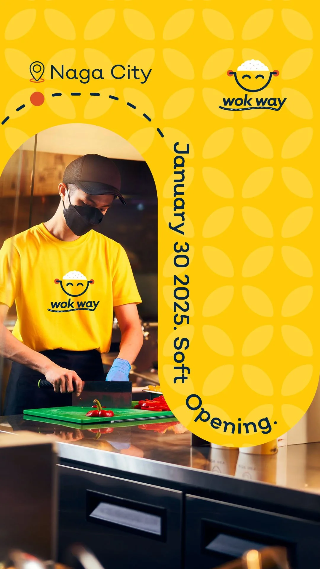
Wok Way was created to bring affordable, Asian-style fried rice to students and low-income communities. In the fast-paced and competitive Philippine food market, the team needed a joyful, memorable identity that could stand out and connect instantly.

Crafting the Joyful Identity
The brief called for something simple, happy, and easy to reproduce. I leaned into the name “Wok Way,” treating it as a small journey and shaping the identity around food as joy and the brand as the path that brings it.
A Smile in Every Scoop
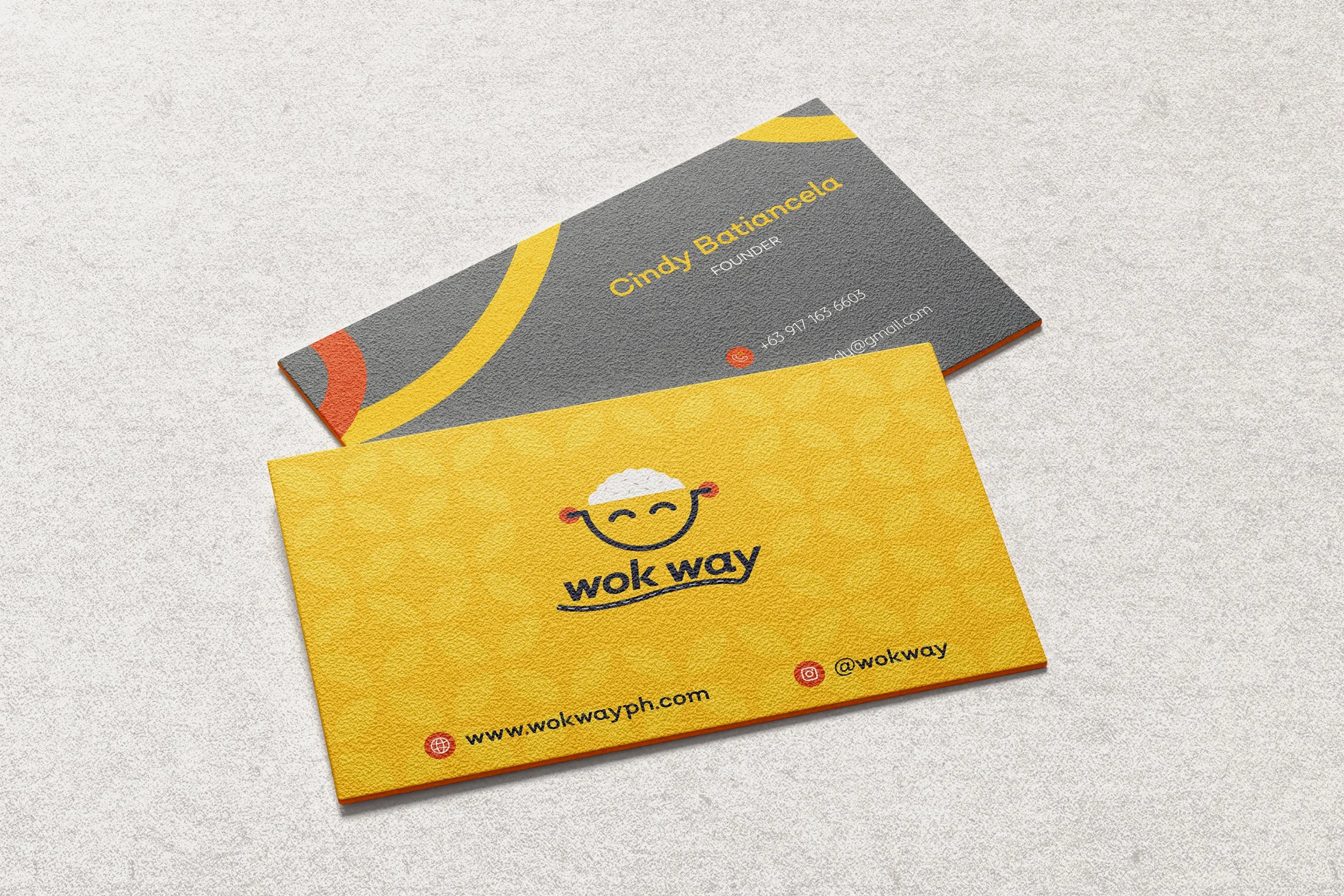
The logo features a bowl of fried rice shaped like a smiley—simple, joyful, and instantly recognizable. It captures the happiness Wok Way wants to serve with every affordable meal. The extended tail on the “Y” of Wok Way adds a clever nod to the “way”—a path to comfort food and contentment.
-
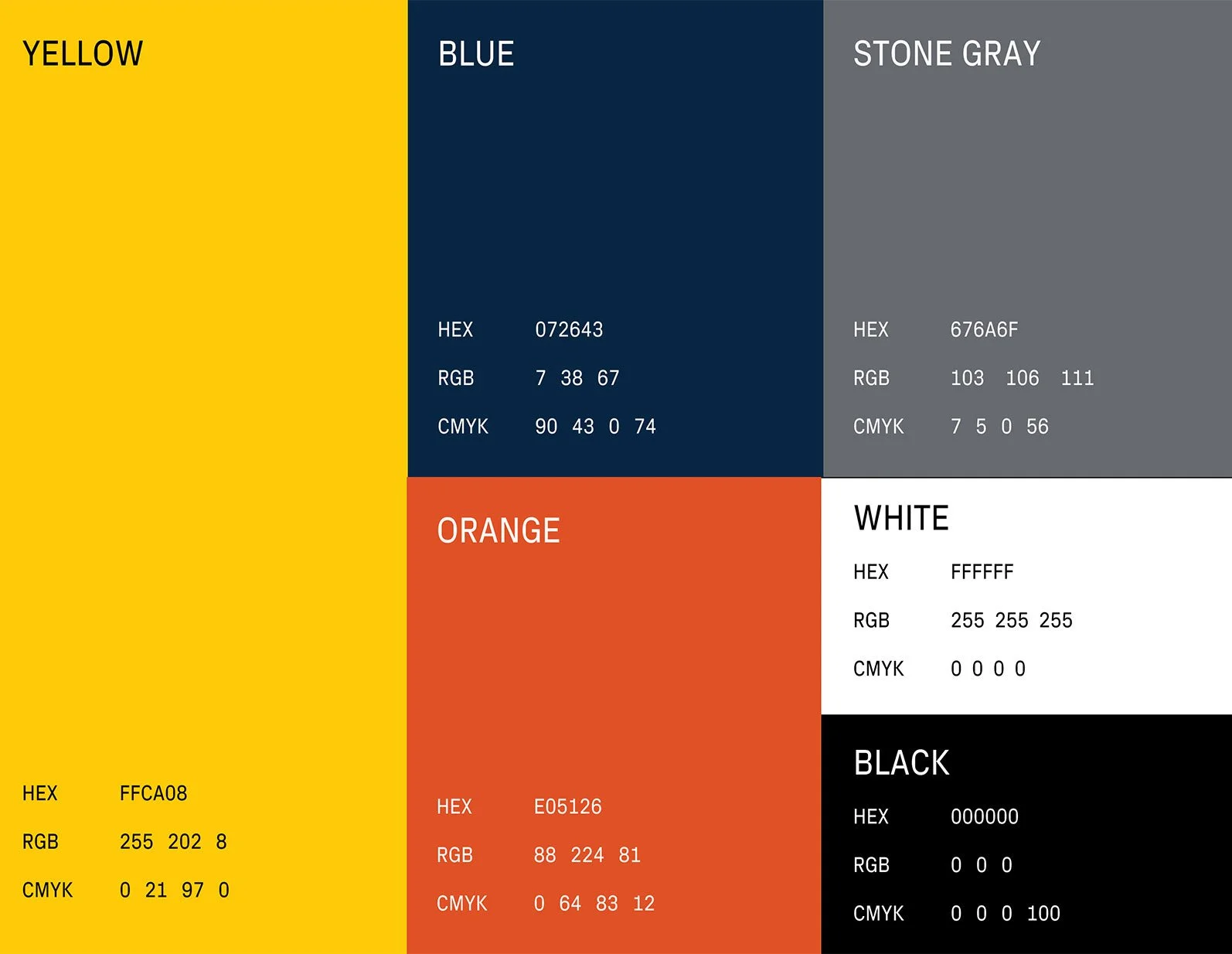
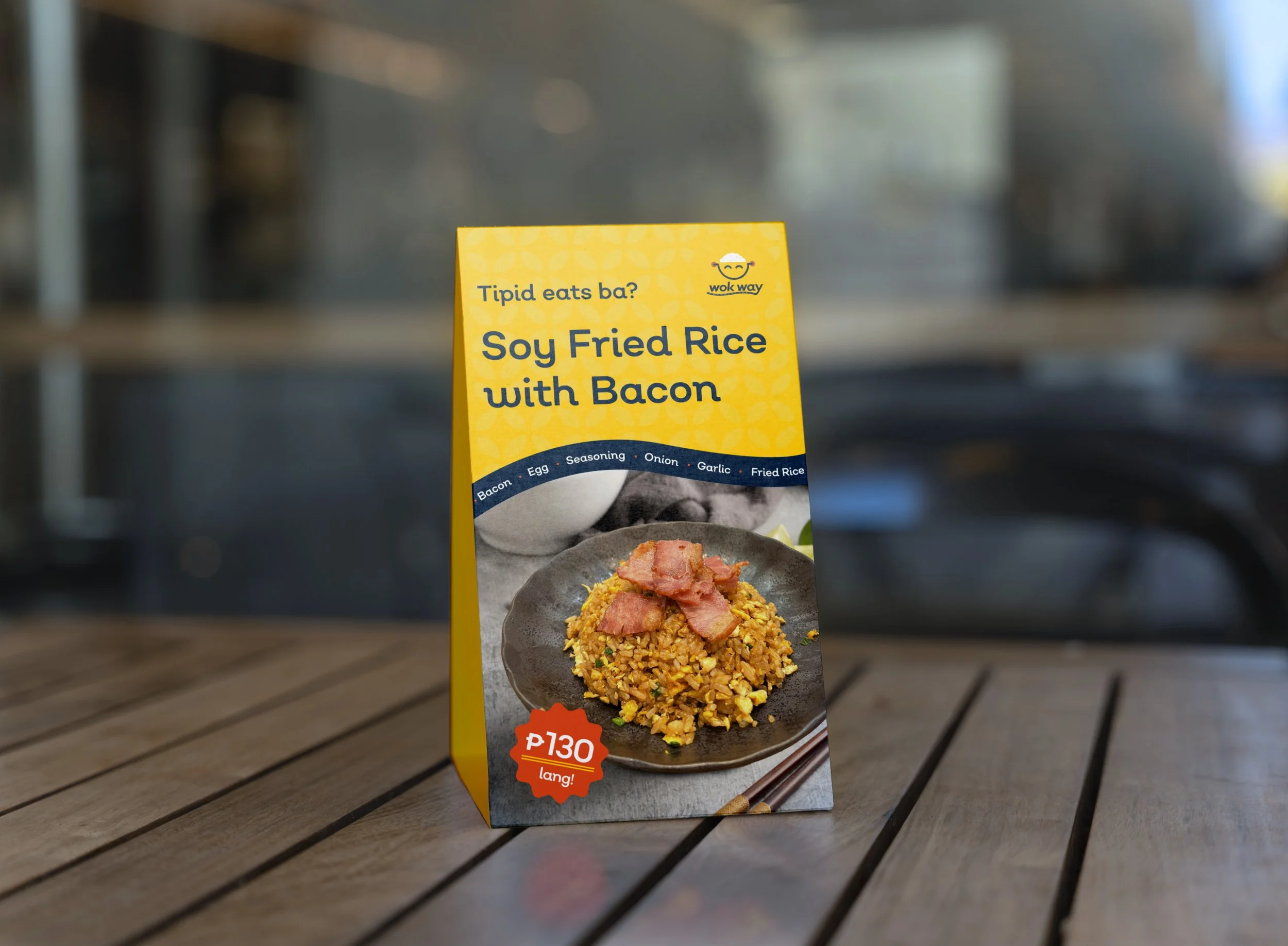
Color Palette
We used sunny yellow and orange to signal joy and appetite, paired with a deep navy for balance and contrast. Stone gray subtly reflects the idea of a "path," grounding the overall look in interiors and bowls.
-

Iconography
Our iconography uses duo-toned yellow and navy, styled with clean curves and rounded edges. This design echoes the smile and bowl motif, making the icons light, friendly, and easy to spot at a glance.
Designed from Grains and Paths
We built a flexible visual system from two things: rice and roads. Curved lines inspired by paths and steam add motion and direction. Repetitive grain shapes symbolize abundance—used subtly as patterns, borders, and textures.
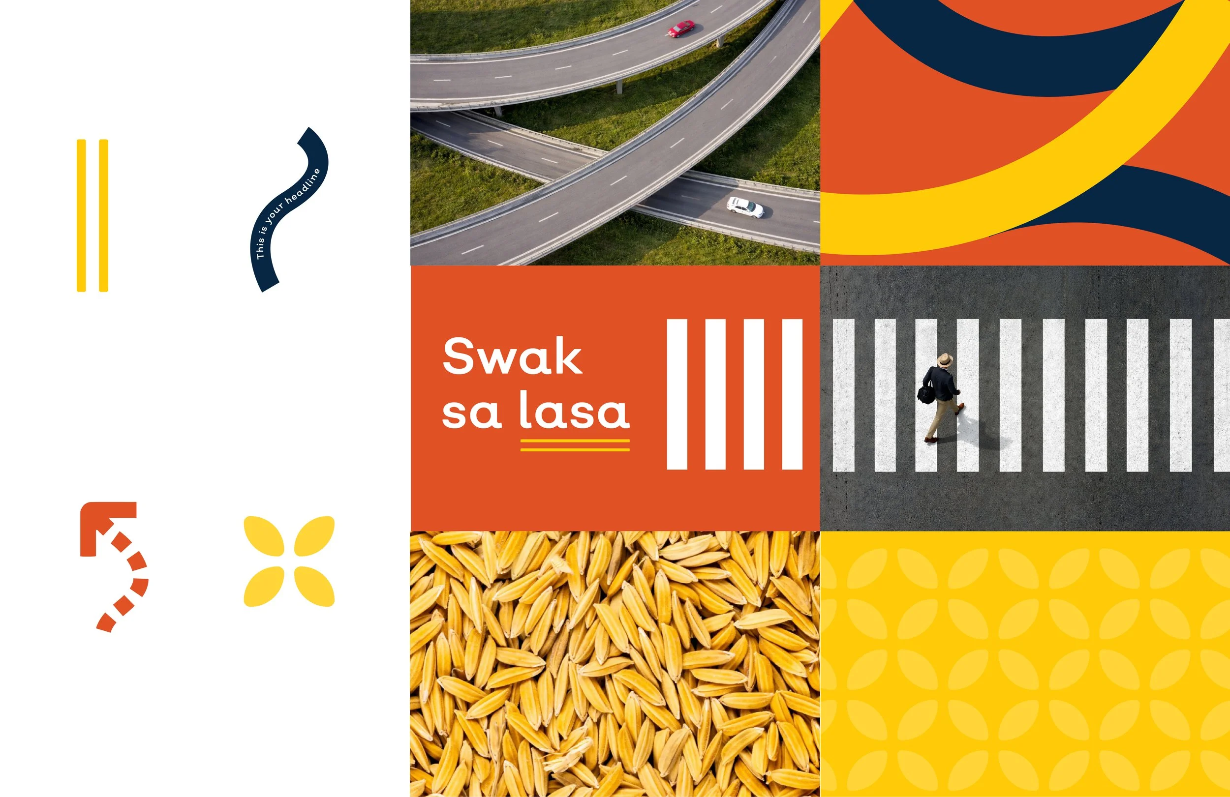
Bringing it all together
The design system radiates joy through its vibrant colors and playful forms. The "way" element flows throughout—woven into typography, textures, and accents—bringing a sense of movement and character. Together, these pieces form a cohesive visual identity that’s as warm, welcoming, and satisfying as a bowl of Wok Way fried rice.


RELATED PROJECTS
-
![]()
Transformasians
-
![]()
NUS Medicine
-
![]()
Galini